

How to match colors in drawing. How to match the colors? How do you put them together without making them screech? How to create contrasts that, despite their power, do not turn into a real eyesore? These are questions that everyone, even unconsciously, finds themselves asking themselves. Of course, the first to understand how to combine colors effectively are the painters, with their brushes and boxes full of paint tubes. But also graphic designers must understand how to create their palette before starting the creation of an infographic, a brochure, a poster, or a cover, and the same must make the stylists, the interior designers, the photographers, the cakes. Designers and, yes, all the other ordinary people too. Who has to dress up every day without creating tragic combinations?
In short, let’s face it: they should teach from elementary school how to combine colors in the right way or, at least, not in the wrong way. If you have come to this article, however, most likely you too have some doubts about it. Maybe you are there, in your small studio, with one of your first canvases, and you don’t know how to combine colors to create the right atmosphere; or maybe you hang out en plan air, with your watercolors, and you don’t know how to reproduce the scene in front of you best. Or again, maybe you are using a graphics program to produce the flyer for your band’s next concert: the choice of colors is presented – difficult – on the most diverse occasions! In this guide, of course, we will not be able to give a precise and ready answer to all the questions you have and that you may have about how to combine colors. However, we will give you all the necessary foundations to make your future choices more appropriate.
Learn how to match colors
To understand how to combine colors, we are convinced, a precise and relatively widespread accessory, the color wheel, can be handy. Have you ever heard of it? If the solution is no, there is no difficulty: it is a straightforward tool to understand. In short words, it is a circle divided into 12 segments in which the various colors (primary, secondary and tertiary) are arranged in a specific way to facilitate the choice of the various colors to use. The as we will see shortly: for now, it is enough to know that the color wheel can use to paint and color with oil paints, acrylics, watercolors, colored pencils, markers, and even programs. Graphics: the juice, in short, does not change.
To understand what a color wheel is and how it is composed. And therefore, to understand how to combine colors – there is nothing simpler than trying to make one at home. All you have to do is get yourself a sketchbook or cards, a brush, and some actual colors: to do this specific exercise, weigh a little. You will only need three paint tubes (you choose whether to use oil colors, tempera, or acrylics).
How to match colors with the color wheel
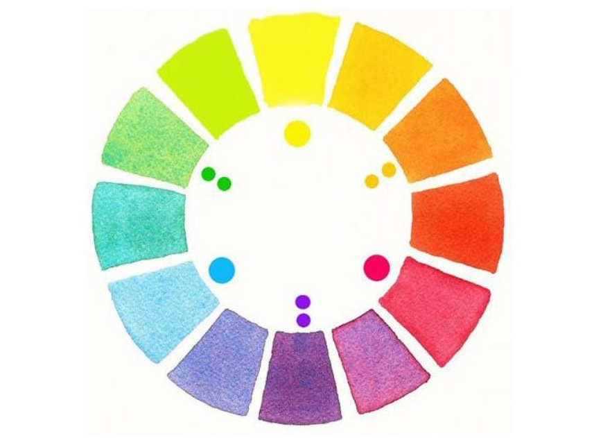
After drawing the circle and dividing it into six segments (for convenience, we will make a reduced color wheel), you will have to go and color three segments with three of the seven colors of the rainbow, and then magenta, lemon yellow, and cyan. So start by painting a wedge of yellow; proceed to the right, skip one, and draw the other wedge of blue; skip another one, and draw the penultimate wedge of red. To complete the circle, fill the empty wedges with the combination of the adjacent colors: we will also have green, purple, and orange. In a nutshell, therefore, from the three primary colors, we will have obtained our secondary colors. Wanting to build a complete color wheel, we would have to repeat the exercise on a wheel divided into 12 segments to have 3 primaries, 3 secondaries, and 6 tertiary colors at the end. Simple, isn’t it? Now that you understand the color wheel, we can discover its use to understand how to combine colors in cool drawings.
How to use the color wheel
Now, after cleaning your brushes carefully, you should have a nice color wheel in front of you. Or maybe you’re a little lazier – in this case, instead of drawing and painting it, you’ve probably found it online, downloaded, and maybe printed. No problem: the critical thing is that you have it before you to understand how to combine colors. Thanks to the color wheel, many different ‘safe’ combinations are presented to create your palette or your palette with specific effects. You could, for example, focus on complementary colors, thus combining the colors placed in opposite positions. Your primary red color, for example, could be matched with your secondary green color: the result, especially if at full saturation, will be a lively match, which must well manage to avoid the jarring effect. In short, it is the ideal combination to make something stand out in a painting, but you shouldn’t overdo it!
However, complementary colors are not always the best choice. You could therefore opt for analogous colors, going to use not the opposites but rather the adjacent colors, thus choosing red, orange, yellow, and so on. As you know by now, these colors tend to blend; moreover, similar color schemes are very often found in nature and help create happy and serene compositions. More complex but still widely used is the ternary color combination, which involves composing a three-color palette by tracing an equilateral triangle on your color wheel: blue, in this way, could be accompanied by orange and green. Also, there will be an accentuated contrast in this case, but never as strong as that of complementary combinations.
How to match colors with psychology in mind
To understand how to combine colors effectively, you don’t have to think only about the color wheel. It would help if you also thought about the effect you want to arouse. Beyond the distinction between warm colors and cold colors – which should not neglect – you should think that, at the psychological level, different colors carry different meanings: blue, for example, communicate relaxation, green instills confidence, the red energy. A painting that wants to express dynamism, for example, could start from the combination of shades of yellow and blue, with a hint of red.
Also Read: LEARN OIL PAINTING