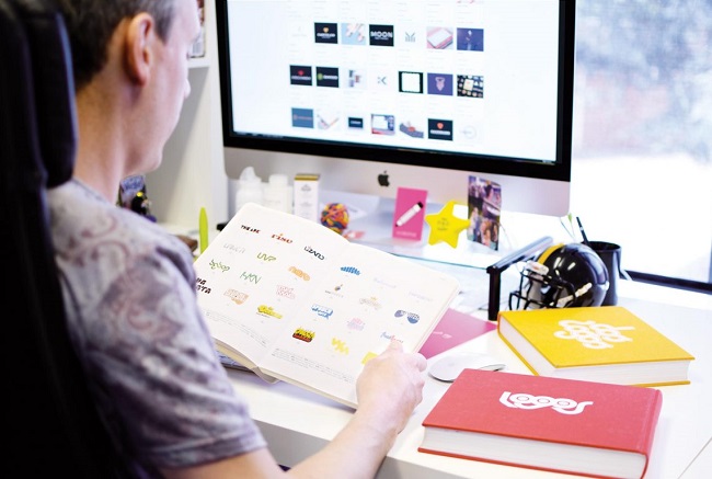
A logo design matters a lot if you want to stay on top. This is why, logo design trends are vital for the web developers. If you keep yourself updated, you will eventually help your portfolio stay relevant and up-to-date. Here, in this article, I have a compiled a list of 6 logo trend designs predicted for establishing brands;
- Flat
The flat isn’t the latest trend, but the hot one! A lot of brands are already following this logo style as it’s easily noticeable and influence the viewer instantly.
Windows, Microsoft, Netflix, and IHOP, are some of the top brand names with Flat logo design. Way back in 2000, all of the brands had bold, 3D logos that were top favorite styles of that era. But, with the evolution of flat logo designs, these enterprises revised their logos that depict the brand in an entirely new way. Flat logos scale well because of their simplicity, and they are more compatible with all mobile devices and browsers.
- Minimalism
It’s not a new concept. During the last several years, Minimalism has gained traction in every area of design from interior designing to web designing. Started in 2014 and becomes a hit in web designs and still its continued importance makes it a sizzling choice for Logos this year.
The style highlights flat designs with quite a few colors to grab the attention of the potential customers. It involves creating a logo with plain white background with a homepage featuring a plain Black text of your logo. It helps in diverting the attention of the clients specifically to the company’s brand and overall message.
- Line Art
The Line Art came into play in 2015 and now have started making its way to logos. It contains Monolines (these are single, thin lines) used to make a particular design. Typically, the thickness of the line remains the same all through the logo and one color is being used, which is jet black.
- Hand Drawn
As a matter of fact, the digital world is in its full swing, but still, there are a lot of people who love hand drawn logos and fonts. That’s the primary reason why this style remains a super duper hit in 2017.The logo typically relies on connected and semi-connected script fonts along with the cute cartoon graphics that depict a delicate feel.
- Negative Space
Although, that’s not a new trend, but it’s getting attention in 2017 again. When it comes to a negative space design, it utilizes while space and fits into a logo as a hidden message. One of the most famous examples of negative space logo design is NBC. There’s a peacock with spread feathers with a lot of vibrant colors displayed. NBC first launched this logo way back in 1956 to promote color programming. In 1979, the logo adopted some of the variations.
- Mixing Things Up
This style is almost similar to the stacked text style, but it uses different fonts to form a contrast in a text based logo. It’s another great design to spruce up the things! You can use Online Logo Maker tools to create your logo.


